travel portland (2019)
role: designer
design direction by Brad Simon, Sarah Hollowood and Karen Koch, type finessing by James Aloysius, design assist by Raina Jung
travel portland (2019)
role: designer
design direction by Brad Simon, Sarah Hollowood and Karen Koch, type finessing by James Aloysius, design assist by Raina Jung
travel portland (2019)
role: designer
design direction by Brad Simon, Sarah Hollowood and Karen Koch, type finessing by James Aloysius, design assist by Raina Jung
travel portland (2019)
role: designer
design direction by Brad Simon, Sarah Hollowood and Karen Koch,
type finessing by James Aloysius, design assist by Raina Jung
travel portland (2019)
role: designer
design direction by Brad Simon, Sarah Hollowood and Karen Koch,
type finessing by James Aloysius, design assist by Raina Jung
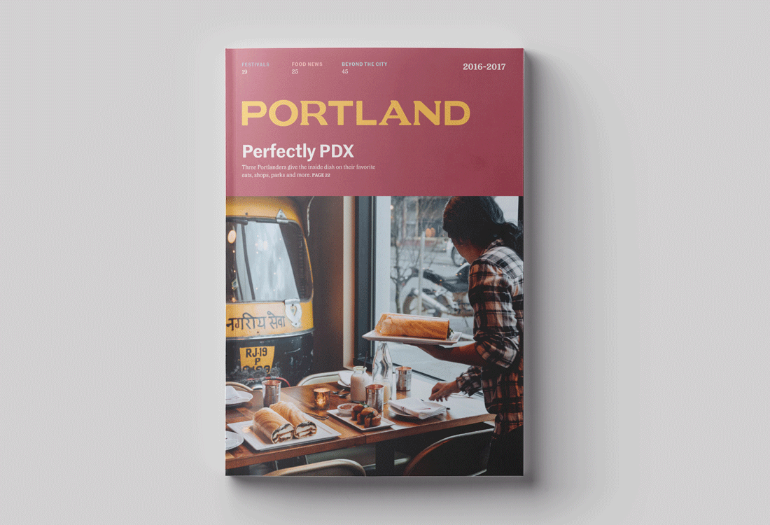
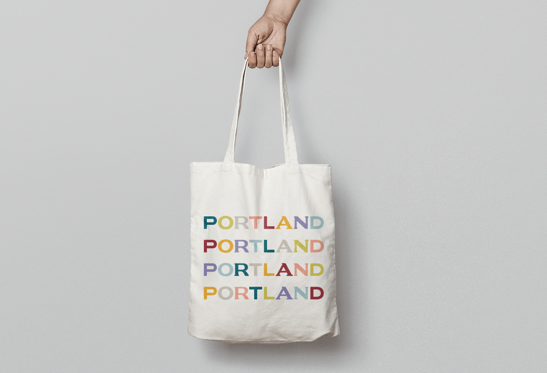
Portland has unquestionably become one of the leading destinations people want to visit. The city’s uniqueness and its “live and let live” vibe are due largely to its independent, lively, multi-faceted community. So, when Travel Portland—the city’s foremost destination marketing and management organization—entrusted W+K to do a rebrand of its identity, they emphasized the importance of creating a visual language authentic to Portland, that characterizes its community in a way that doesn’t parody it.
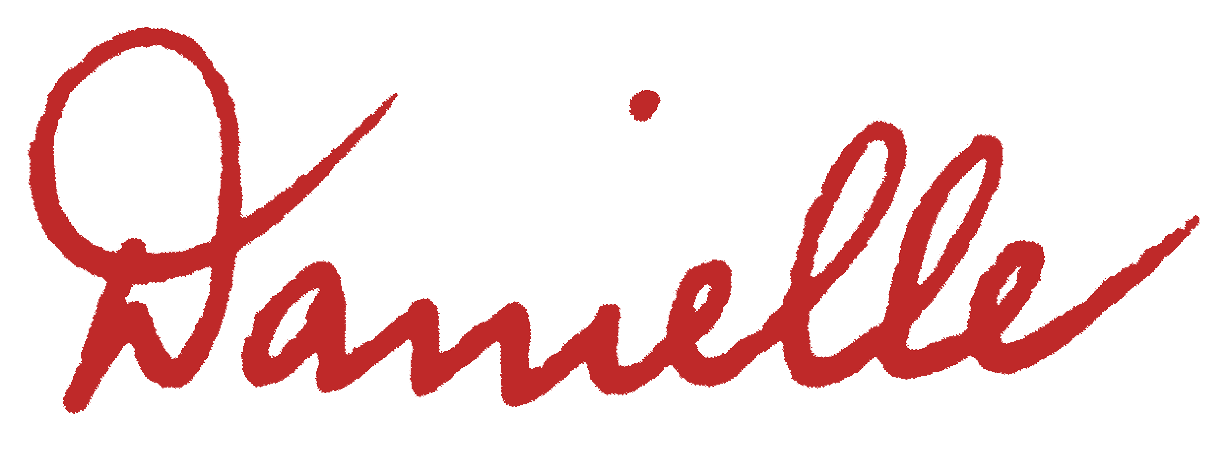
As part of the team on this project, I focused primarily on logotype exploration. The new logo prioritizes “Portland” and references the city’s distinctive neighborhoods and people. The rounded corners of the letterforms suggest an open-minded friendliness. The interplay between the serifs and sans serifs gives the mark a dynamic energy. It conveys that the city is a place with history (serifs), a modern sensibility (sans serifs), and many places in between.
Portland has unquestionably become one of the leading destinations people want to visit. The city’s uniqueness and its “live and let live” vibe are due largely to its independent, lively, multi-faceted community. So, when Travel Portland—the city’s foremost destination marketing and management organization—entrusted W+K to do a rebrand of its identity, they emphasized the importance of creating a visual language authentic to Portland, that characterizes its community in a way that doesn’t parody it.
As part of the team on this project, I focused primarily on logotype exploration. The new logo prioritizes “Portland” and references the city’s distinctive neighborhoods and people. The rounded corners of the letterforms suggest an open-minded friendliness. The interplay between the serifs and sans serifs gives the mark a dynamic energy. It conveys that the city is a place with history (serifs), a modern sensibility (sans serifs), and many places in between.
¹ Early logo exploration
¹ Early logo exploration
¹ Early logo exploration
¹ Early logo exploration
¹ Early logo exploration
² Primary logo
² Primary logo
² Primary logo
² Primary logo
² Primary logo
³ Primary logo stacked for small-scale use only (smaller than 1.5 inches)
³ Primary logo stacked for small-scale use only (smaller than 1.5 inches)
³ Primary logo stacked for small-scale use only (smaller than 1.5 inches)
³ Primary logo stacked for small-scale use only (smaller than 1.5 inches)
³ Primary logo stacked for small-scale use only (smaller than 1.5 inches)
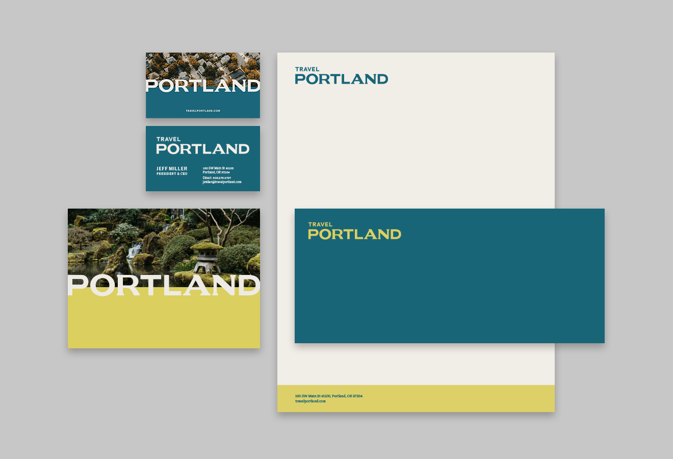
⁴ Secondary logo
⁴ Secondary logo
⁴ Secondary logo
⁴ Secondary logo
⁴ Secondary logo
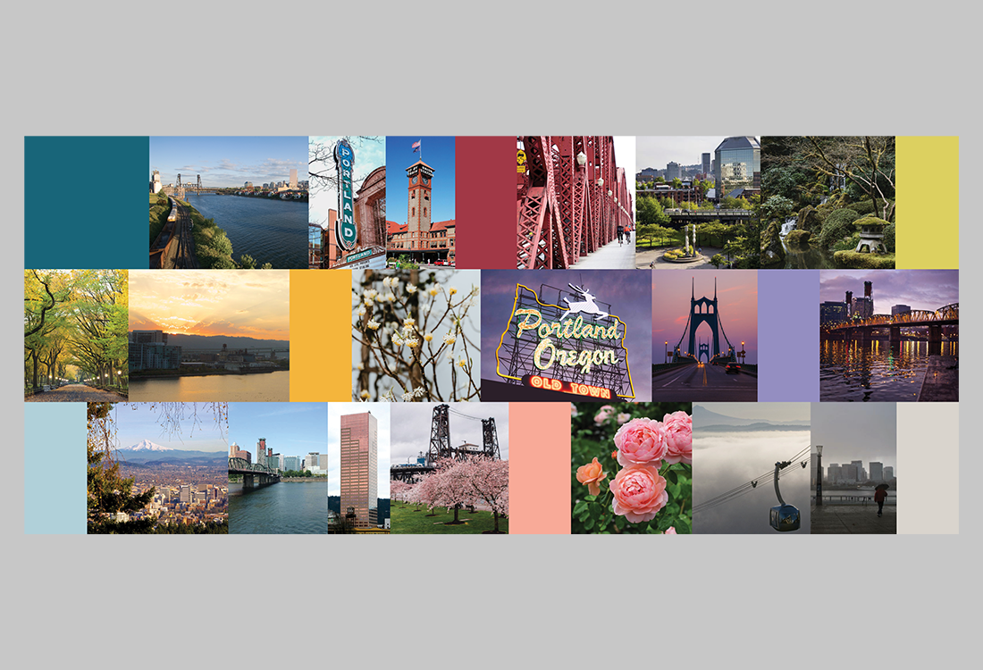
⁵ Color palette
⁵ Color palette
⁵ Color palette
⁵ Color palette
⁵ Color palette
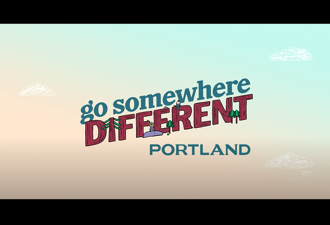
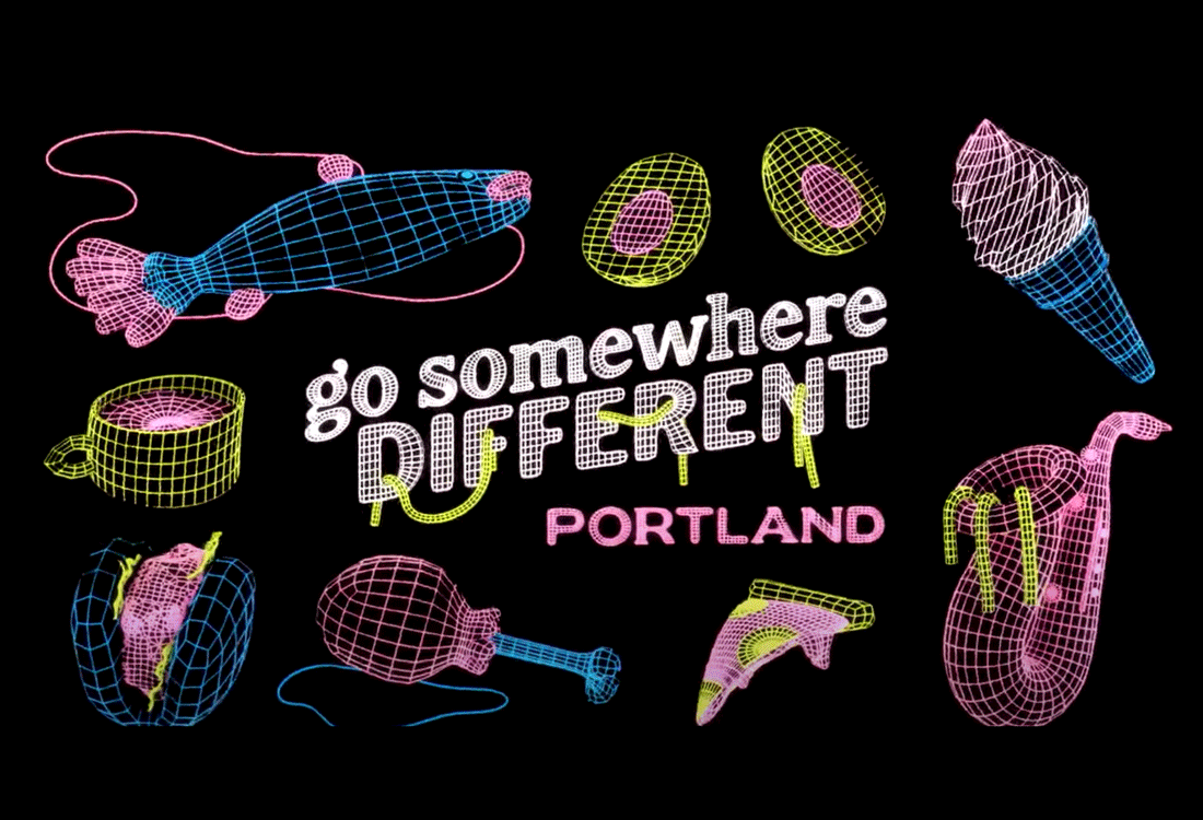
* Illustration by Nick Stokes for Travel Portland's "Go Somewhere Different" campaign
* Illustration by Nick Stokes for Travel Portland's "Go Somewhere Different" campaign
* Illustration by Nick Stokes for Travel Portland's "Go Somewhere Different" campaign
* Illustration by Nick Stokes for Travel Portland's "Go Somewhere Different" campaign
* Illustration by Nick Stokes for Travel Portland's "Go Somewhere Different" campaign
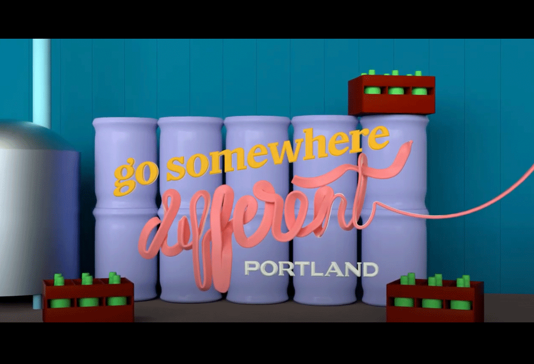
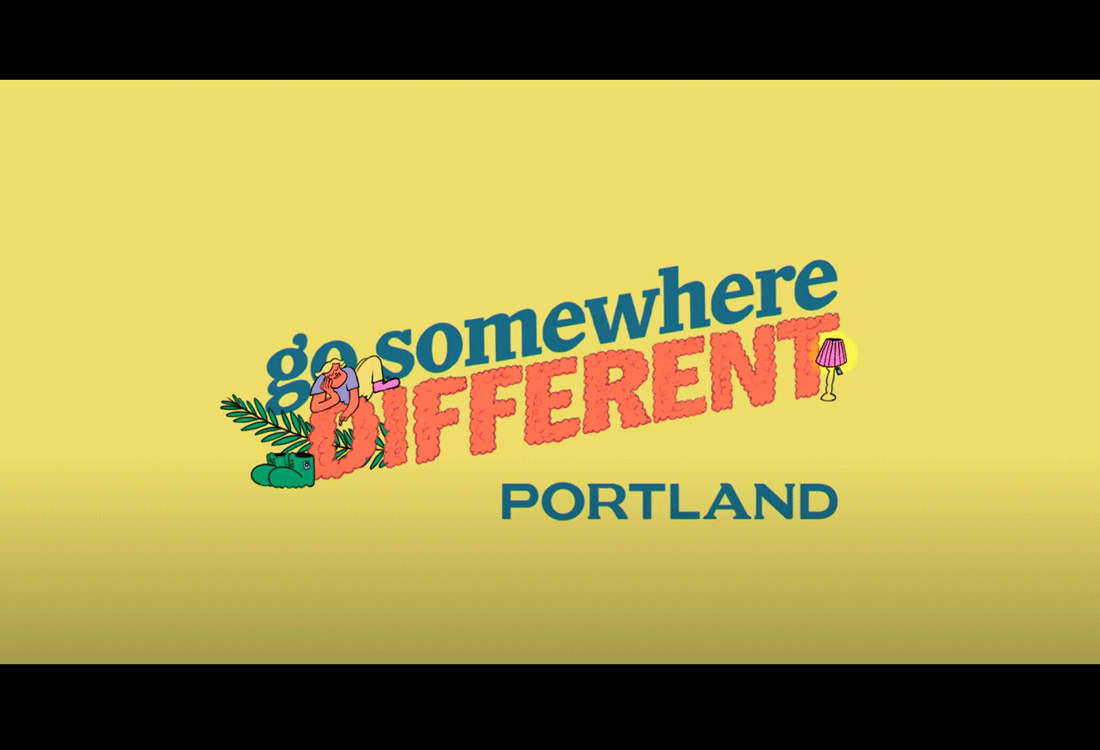
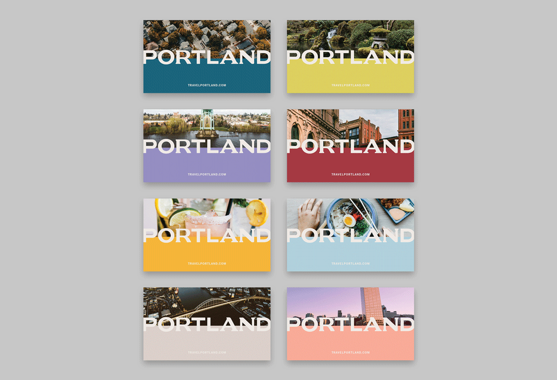
* Primary logo in use on end cards for Travel Portland's "Go Somewhere Different" campaign
* Primary logo in use on end cards for Travel Portland's "Go Somewhere Different" campaign
* Primary logo in use on end cards for Travel Portland's "Go Somewhere Different" campaign
* Primary logo in use on end cards for Travel Portland's "Go Somewhere Different" campaign
* Primary logo in use on end cards for Travel Portland's "Go Somewhere Different" campaign


